I have a 30-ish minute daily commute on the subway. Sometimes I listen to a podcast, but when I’m not in the mood, I play chess on my phone. (I wish I were cool enough to be one of those people who effortlessly holds open a 400-page hardcover book with one hand while standing.)
Like most things in life, I’m not particularly good at it (sigh), so I’ve been improving through Duolingo Chess and Chess.com lessons. Unsurprisingly, Duolingo sends me more and more unhinged push notifications for each day I forget to do my lessons.

It never ends…
Today we’re diving into a simple change Chess.com made that increased conversion to paid and retention. It’s the perfect Tiny Big Move. Also be sure to read to the bottom and answer the riddle!
The Backstory
How Chess.com got here.
Chess.com allows you to play chess online with other users, or with bots if you’re shy. After you finish a game, it has a nifty feature called Game Review, which provides a detailed analysis of the game you just played.
Launched in 2022, Game Review is an engine that walks you through your finished game move by move and grades each one, from Brilliant to Blunder. You get to “relive your greatest moves and pinpoint the moments where things went wrong”, along with a virtual coach who helps you learn from your mistakes.
It is also an important part of Chess.com’s freemium model. You get one Game Review per day for free. If you want more, you need a paid subscription.
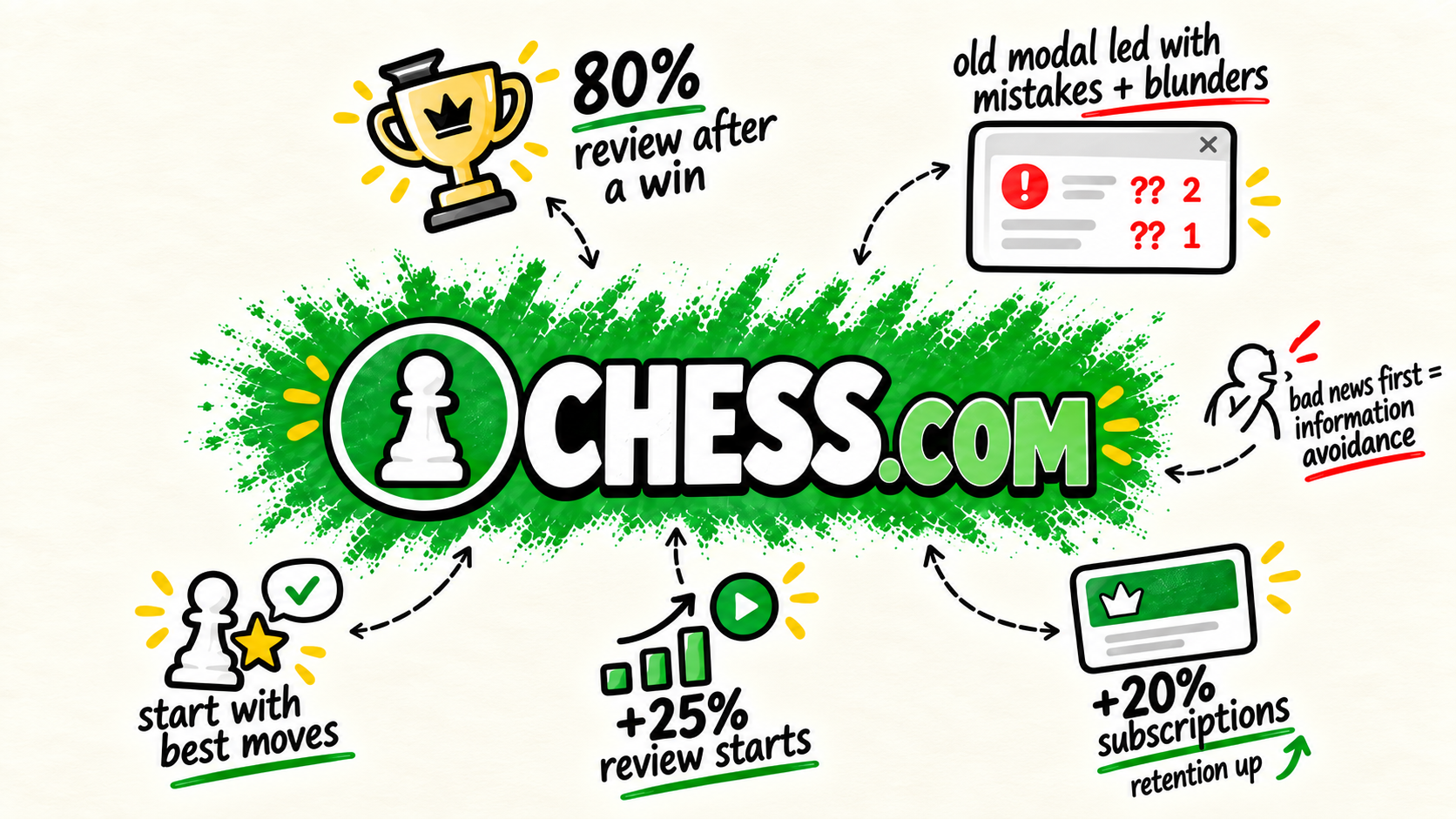
After a game ended, a black box appeared over the board. Whether you won or lost, it showed counters for things like mistakes and blunders, followed by the button to open Game Review.
Which makes sense. If you just lost a game, surely you want to know what you did wrong so that you can learn. That was basically Chess.com’s assumption too. They thought people would use Game Review to study their losses.

Turns out they were very wrong.
SPONSORED BY

Stride builds teams for early-stage NYC startups and is run by two former PMs who spent the last decade hiring at companies like Amazon, Microsoft, PwC, and VC-backed startups.
If you're struggling to hire or looking for your next role, reach out to their founders: Zakir Tyebjee and Wes Repass.
The Tiny Big Move
The single decision that changed how users behaved.
According to Chess.com’s Head of Growth, roughly 80% of people who used Game Review did so after A WIN. Not a loss.
These weren’t people looking to improve themselves; these were winners who wanted to gloat and savor their victory. As their director of product said, “People just want to feel good about themselves. They don't necessarily want to like focus on the things that they've done poorly.“
This was counterintuitive to how the team had envisioned the product. The feature had been built around the idea that losing would make people want to learn. In reality, four out of five people reviewing games were coming in after they had already won.
After a win, seeing “2 mistakes” barely matters. You won. You’re feeling good. You might open the review because you want to see the brilliant move you made or understand how dominant your victory really was. After a loss, those same numbers make you feel way worse. It’s honestly just adding insult to injury.
So they just…flipped it.
Instead of leading with all the bad things you did, they start with your best moves and have the coach say something encouraging.

The mistakes are all still there, and the Game Review still grades your moves exactly the same way. All they changed was what it showed you before you opened it.
The move increased Game Review starts by 25% and subscriptions by 20%. Retention also improved, according to the team.
It is always impressive when a small change can make such an outsized impact.
The Psychology
The Chess.com explanation is pretty straightforward: people like feeling good about themselves. And that’s true; I can always use more praise if you’re offering.
But there is a more interesting explanation under the surface. The old modal gave you the criticism before showing the value. It told you everything you did wrong (mistakes, blunders, “you’re a loser”) first before you got anything useful.
Behavioral economists have a term for avoiding information that is available and potentially useful because of how the answer might make us feel: information avoidance.
It’s like when you don’t want to look at your credit card bill the morning after a night out. Buying shots for everyone at the bar seemed so reasonable at the time.
A paper on the subject argues that people sometimes avoid information not because getting it is difficult or expensive, but because they anticipate that the answer will be unpleasant. This can take many forms:
People skip medical tests for scary conditions more than for treatable ones.
Investors check their accounts more when markets rise and look away when they fall.
People seek out views they already hold and dodge ones that challenge them.
Chess is obviously much lower stakes. Unless you’re Ron Weasley playing wizard’s chess, in which case losing can apparently involve being violently thrown from a horse. But the shape of the behavior is similar.
The lesson isn’t “never give users bad news.” It’s that where you put the bad news can determine whether users ever reach the thing that helps them act on it.
SPONSORED BY

You bought something online with a credit card. You may have even used the “right” credit card.
But did you:
Activate offers on your credit cards
Use a shopping portal
Check for heavily discounted gift cards
Shoppers who use Savewise earn 7-10x more points & miles for things they’re already buying.
Savewise finds every way for you to earn rewards and puts them all in one place.
The Takeaway
If your product is supposed to diagnose, coach, or help someone improve, be careful what the entry point tells them first.
A preview should give users enough information to want the deeper answer. It should not hand them the emotional conclusion before they have received any of the value.
Imagine an AI code reviewer that opens with:
17 problems found.
Or a wearable that greets you with:
You missed your goal by 23%. (This is why I dread looking at my Oura sleep score on the weekends.)
Or a writing tool whose first message is:
Your draft scored 58/100.
In each case, the product may be completely correct. But if the real value lives in the diagnosis, coaching, or next step behind that screen, the preview may be causing the user to avoid the information.
This is especially worth looking at when your product:
evaluates something the user created or did
already knows whether the outcome was good or bad
requires the user to choose whether to inspect the deeper analysis
Sequence the criticism so it arrives with the value that makes it worth hearing.
This lesson only becomes more important as we stick LLMs into every product to provide guidance and intelligence. No one needs their toaster telling them that they’ve burnt their bread for the last four days in a row.
I hope you enjoyed the read. I’ve been working really hard to grow this newsletter, and I could use your help. Please, please, please share this newsletter with a friend or coworker and make my day!
And as promised, here is your riddle for the week. Reply with your answers:
I’m full when I’m empty and empty when I’m full. What am I?
The Meme
